|
|
|
alt-usage-english.org |
| Home |
| Newsgroup |
| Intro Documents A B C D E F G |
| FAQ |
| FAQ Supplement |
| ASCII IPA |
| Audio Archive |
| Links |
| UCLE Corner |
| What's New? |
| Search |
| Site Map Where am I? |
| Contact |
|
|
The Totally Official Logoa note from the webmaster
|
|
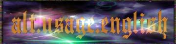
As most AUE readers probably know, AUE has a totally official logo. This logo adorns the breast of the AUEers who have managed to acquire a Totally Official AUE tee shirt. (If you want to be among the breast adorners, watch AUE postings for the announcement of a boink. Instructions for obtaining a tee shirt will be included in the announcement.) The logo image is also scaled down and used as a banner for the home page of this AUE Web site, and a rather larger version adorns this page. But these reductions don't do it justice - if you can stand a 750 Kb download and an image that probably won't fit on your screen, feast your eyes on the details of the full-size logo. The history of the logo is shrouded in mystery. I've been told that it came to us from an earlier generation of AUE contributors - dates as early as 1992 have been mentioned. My informant chose not to tell me their names, just that they were amateurs and hobbyists who created something for AUE. Part of the lore associated with the logo has to do with conditions for its use that have also been handed down from our logo-fathers. Here is a statement by a present-day AUE member who prefers to remain anonymous and who is much more knowledgeable about logo lore than I am:
     Usage Conventions
     -----------------
     Our logo may be used freely on any 'on-topic' page or article mounted by
     an aue contributor. It may also be used freely by webmasters and page
     designers to contain a hyper-link that points to [this site's home page], or
     by other media for articles that pertain directly to alt.usage.english;
     and we encourage its use in this context because it promotes
     recognizability. Use of this logo for profit, or in a context that
     embarrasses alt.usage.english is prohibited. Further questions on the
     use of the Totally Official aue Logo can be answered by posting an inquiry
     at <news:alt.usage.english>.
The logo has aesthetic appeal, but just what its original creators meant it to represent is unknown to me. I asked an AUE contributor who also prefers to remain anonymous to give me a summary of his impressions as he looked at the logo. Here is his response: The logo shows three galaxies. The OED defines galaxy as 'independent
systems of stars held together by gravitational attraction', 'a
brilliant company or gathering'. Three galaxies might be taken as a
metaphor for the three major English speaking land masses.
The lettering appears to be taken from a traditional engraver's font, which evokes the sense of 'Old English', while still retaining clarity. This lettering style, combined with the lens flare, provides a striking juxtaposition of traditional and technical. Finally, there is a border around the scene that uses an agate texture. The highly variegated texture might suggest the diversified nature of the English language. This webmaster particularly likes the border. |
 I count six instances of lens flare in the logo. They are more or less
equally distributed throughout the image. I would take this to
represent technology, such as that offered by Usenet.
I count six instances of lens flare in the logo. They are more or less
equally distributed throughout the image. I would take this to
represent technology, such as that offered by Usenet.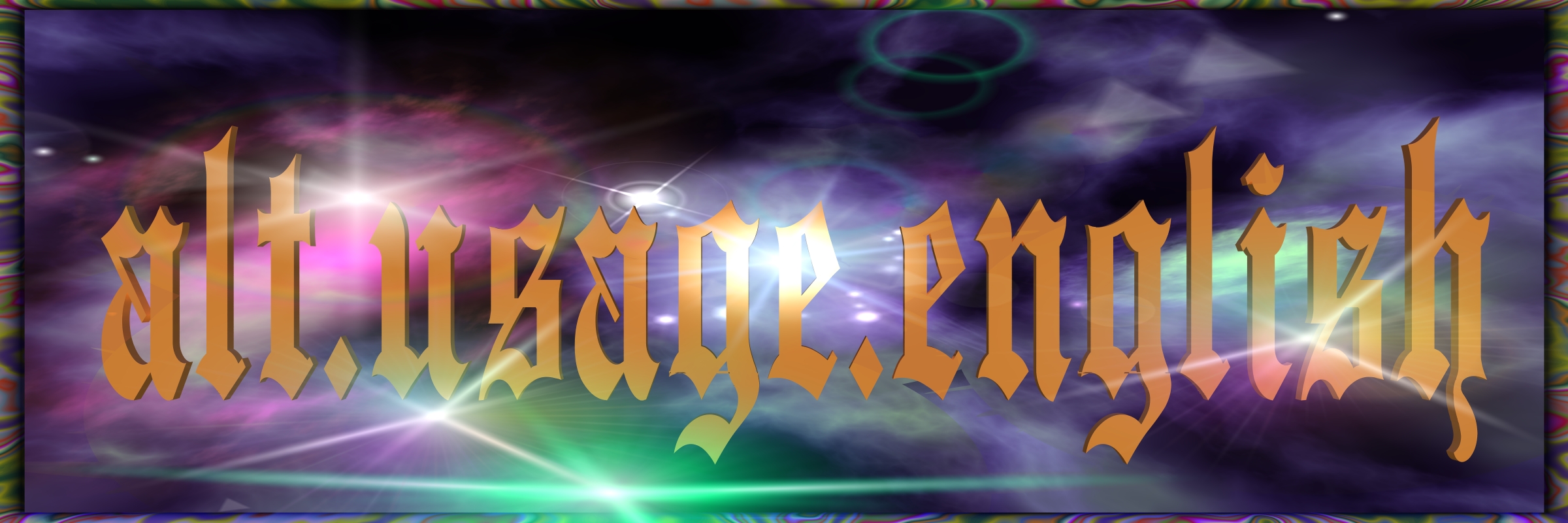
|